In case you missed it, the Go guys announced an official font today.
Fonts and typography are like a weird little undercurrent in programming. Knuth famously took about a decade off from his massive Art of Computer Programming project to invent TeX and METAFONT. He did this because he found the second edition printing much uglier than the first and decided he needed to fix this problem.
Knuth spent a decade mastering typesetting and typography. And his book is incredibly beautiful. Knuth, being of pure light and glory that he is, also designed the only font any of us has needed to use since 1975. That’s why everybody uses Computer Modern today, right?

Unfortunately, Knuth spewed enough bullshit about aesthetics and typography that programmers started to believe him. After all, if he could compute the time complexity of shell sort, he must be able to perceive things others of us cannot. TeX and LaTeX became the official arbiters of aesthetics amongst programmers, and just as rejecting the user-hostility of Linux was the mark of an inferior computer user, rejecting the horrifying ugliness of Computer Modern helped maintain a hostilities between programmers and designers that only began to erode after Web 2.0 started to take shape.
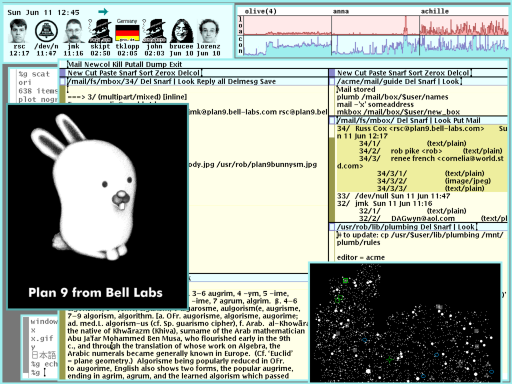
Plan 9 also manifested this tradition with their incredibly ugly color scheme and, surprise, custom-made fonts. Take a look at the “beauty” of Plan 9:

This is justified by Rob Pike (recognize the name from Go?) according to the 9Front FQA as:
…the color scheme is (obviously) deliberate. the intent was to build on an observation by edward tufte that the human system likes nature and nature is full of pale colors, so something you’re going to look at all day might best serve if it were also in relaxing shades.
What an odd move on the part of the Go team! I like go fmt though, it really represents an attempt to address a way that programmers create more work and bullshit for each other by homogenizing things. Maybe the official Go font will help with that? I doubt it, because font choices on the part of one programmer really don’t affect another.
They’re supposedly doing this to get past “encumbrance” issues with using other people’s fonts, but that sounds like a misunderstanding or a red herring. In practice, there are already free and unencumbered fonts, and most of us just don’t wed our interfaces to specific fonts that closely.
It seems a lot more likely to me that this is a funnily obvious manifestation of a bug in the amber. At worst, maybe just a weird piece of Russ Cox’s brain that occasionally explodes out into the real world; at best, a complete set of fossilized notions from the glory days of Unix, that:
-
typography is important. (I agree that it is, but people seem to survive using Word and Pages without lightning burns)
-
our weird aesthetics based on math are better than the outside world’s aesthetics, which seem to be based on the crazy notion that good looking things should look good (#MadLads!!!)
-
perhaps most sadly funny, the idea that Unix and its inheritors in Plan 9 and Go have something positive and meaningful to say about typography and aesthetics today, after all the phototypesetters have been put to bed and nobody uses troff anymore, or even TeX outside academia.

I think it would be nice if number 3 were true. TeX is still an amazing piece of technology. The things that Knuth discovered really should be enshrined in a better system that isn’t quite as stuck in the 70s. (Did you know that the way you run external commands from TeX is by writing to file descriptor #18!) LuaTeX 1.0 is out, maybe that will save everything? You can use real fonts now… but we need to accept that real fonts are made by real typographers using software that is not Emacs.
Why do we care so much about this? Maybe we just spent more time than most staring at text on a screen.
I don’t think the Unix etc. has made its final statement about typesetting. But for us to get there, maybe we should try and let go of typography. The battle’s over, Adobe won.