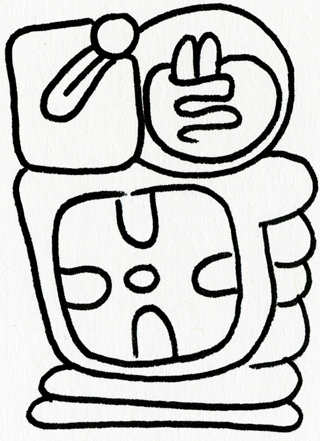
There is one official Toki Pona orthography, which is the one based on the lowercase Latin alphabet. There are two others: sitelen pona, the script, and sitelen sitelen, which looks like Mayan hieroglyphs. For instance, ale li jo e tenpo (everything has a time) renders in sitelen sitelen as the rather large:
And this is rendered in sitelen pona as ale li jo e tenpo.
Radicals in sitelen pona are an interesting idea. The color triangle forms a radical:
- kasi kasi (plant) + kule - color → laso - green/blue (plant color)
- uta uta (lip) + kule → loje - red (lip/mouth color)
- suno suno (sun) + kule → jelo - yellow (sun color)
Another radical is three lines emanating up, which seems to represent taking something and making it active somehow.
- luka (hand) → pana (give)
- lipu (document) → sona (knowledge)
- ijo (thing) → toki (speak)
There are a few more that use luka (hand) as a radical:
- luka + ilo ilo (tool) = kepeken kepeken - use
- luka + ijo ijo (thing) = pali pali - work
- luka + uta uta (mouth) = moku moku - eat/food
Most of the prepositions are formed by placing a box-like radical with a dot indicating placement:
- poki poki - container
- anpa anpa - below
- poka poka - next to
- insa insa - inside
- monsi monsi - behind
- sinpin sinpin - in front of
Sometimes the circle seems to be more like a personhood radical:
- jan jan - person
- jo jo - have
- lape lape - sleep/rest
- lawa lawa - head/leader
- mama mama
- wawa wawa - power
- mije mije - male
- meli meli - female
It also seems to have that connotation in the pronouns:
- mi mi - I, me, we
- sina sina - you
- ona ona - he/she/it/they
I also like the “nesting” composition for compound words. Several of the words (especially jan, ijo and tomo) are great for it: “the boss gave poison to his workers in the war room” might be jan-lawa li pana e ijo-moli tawa jan-pali lon tomo-utala. The nesting makes the content words darker than the syntactic words (li, e , tawa, lon) making it easier to see which concepts are together. This should make it easier to read Toki Pona in cases where two words are meant to be taken together as a compound.
Here’s a large list for this font:

Many things which are unappealing about sitelen pona are addressed by this font, Linja Pona. For instance, ko ko has a pretty ambiguous definition, but looks more like a character here. Also, olin olin looks significantly better in Linja Pona than in pu (the official Toki Pona book “pu”).
I also find the cartouche idea interesting, where the first sound of each word in the cartouche tells you a letter in a name. So “jan Elena” becomes something like jan [_esun_len_en_nasa_alasa].
The above “radicals” suggest simplifications for Toki Pona, which is not something one would expect could be simplified much further.
Now I have some criticism.
-
Several characters seem to be intentionally unstructured. The worst offender is jaki jaki, followed by ko ko, which is at least improved in this font.
-
The only difference between lili lili and suli suli is the size of the glyph. Because of this, only the idea of smallness can be composed inside another glyph, bigness will always have to be written alongside. Your jan-lili (children) will not understand the sona suli (big idea).
-
Related to the suli / lili situation, lete lete (cold) can be embedded in other glyphs but seli seli (hot) cannot. Enjoy your telo-lete (ice water) but not your telo seli (hot water).
-
There are also a lot of characters that are liable to be confused with each other, especially the pronouns mi mi, sina sina and ona ona. You could say the same thing is a problem in the Latin alphabet with d b q p I suppose though.
-
There seems to be a relationship between sin sin (new) and namako namako (extra/spice) but I don’t get it.
-
kin kin follows the pattern set by a and o , except that the asterisk-shape should imply cold because of lete lete. I’m also not sure it’s a good idea to derive word characters from punctuation, especially punctuation from another language.
-
The prepositions seem like the kind of thing one would have trouble writing or remembering, which is compounded because many of them have senses that are different from their visual interpretation. For instance, anpa can mean defeat, and lon lon is used for a variety of purposes including “is here”, “exists” or “is true.”
-
Several characters seem to be taken whole from other orthographies without any real reason: nanpa for nanpa (number), esun esun, which means commerce or market. Also sewi sewi, which means high or divine seems like it should be a dot above the poki poki box for consistency with the other prepositions, although it does have this important meaning as well. ken ken (can, able to), I guess is so abstract there isn’t a more direct graphic way of conveying it.
I see some of these as playfully messing with Western-American sensibilities (the £ for money instead of $, Arabic for “Allah” as divine or above) but at least sewi misses an opportunity for more consistency while also illuminating the missed opportunity for the other prepositions, to come up with something more distinctive than dots near boxes.
-
I am thoroughly confused about why selo is selo yet sijelo is sijelo. The former means “surface, peel” and the latter means “body” or “physical state.” I have no idea how either of these glyphs is supposed to invoke these senses.
I kind of think a stack of lawa noka would have been good for sijelo, to represent a body as “from head to toe.” I think selo should probably have been concentric circles, which are currently the glyph for sike sike. Why is the glyph for circle two circles? Because ijo ijo is one circle. This gets reinforced by glyphs like pali pali which compound the idea of thing (pali, work, here recalling “make thing with hands”). Except it is already somewhat undermined because in many complex glyphs, the circle stands in for “person” rather than “thing” (mama mama being the best example).
Overall, I like sitelen pona a lot. Despite the shortcomings, it seems to be used quite a bit. The availability of this very nice font I think helps a lot.